Jasper Johns Primary Numbers
While some of the subject matter of Jasper Johns' work is a bit too heavy for my tiny humans, it IS a great starting point when talking about American Pop Art and primary colors. There's something about the primary colors that draws an audience- it's true of any artist who uses them. We're in the middle of the Kinder USA unit so I introduced them to Jasper and his work.

While students are at their tables I show them several examples of Johns' work- sculptures, paintings, and prints. I pulled prints that show the common objects he's chosen as subject matter: numbers, flashlight, bullseye, the American flag, etc. What do they see? Anything you recognize? What colors does he use? Is there a color family name for those colors? I wrap it up and tell them we'll be making a number painting in his style. Time to get this party started!
Materials:
+ scrap paper
+ pencil
+ sharpie
+ number stencils
+ canvas paper
+ acrylic paint - R, Y, B
+ brush and water bucket


I created stencils from one of Johns' prints but they're pretty big so I give my tiny humans time to practice the first step. I show them how to hold down the large stencil without it moving around so much. They trace with pencil first and then follow up with the sharpie. When they've finished practicing on their scrap piece of paper they come exchange it for the good canvas paper- of which there is only one per student. They repeat the process on their good paper, clean up their supplies, and go read a book while the other students finish up. This also allows me to set up for the painting step.

Because I teach this lesson on two separate days I put the acrylic paint in sealable condiment cups. It made clean up a breeze and prevented paint waste- win win! I have the tinies begin inside their number, as if it were a coloring book page. For most of them this gives them a solid starting point and generally leads to a more thoughtful piece of work.


My directions are pretty simple:
1. Color mixing is cool- it's gonna happen- but try to focus on the Primary Colors because we are taking inspiration from Jasper Johns.
2. Keep the paper away from your belly!
3. Think about what colors should go next to each other. If you paint red next to red you may not be able to see part of your number very well. Try not to put the same color next to itself!
4. I should be able to see your number when you're finished.


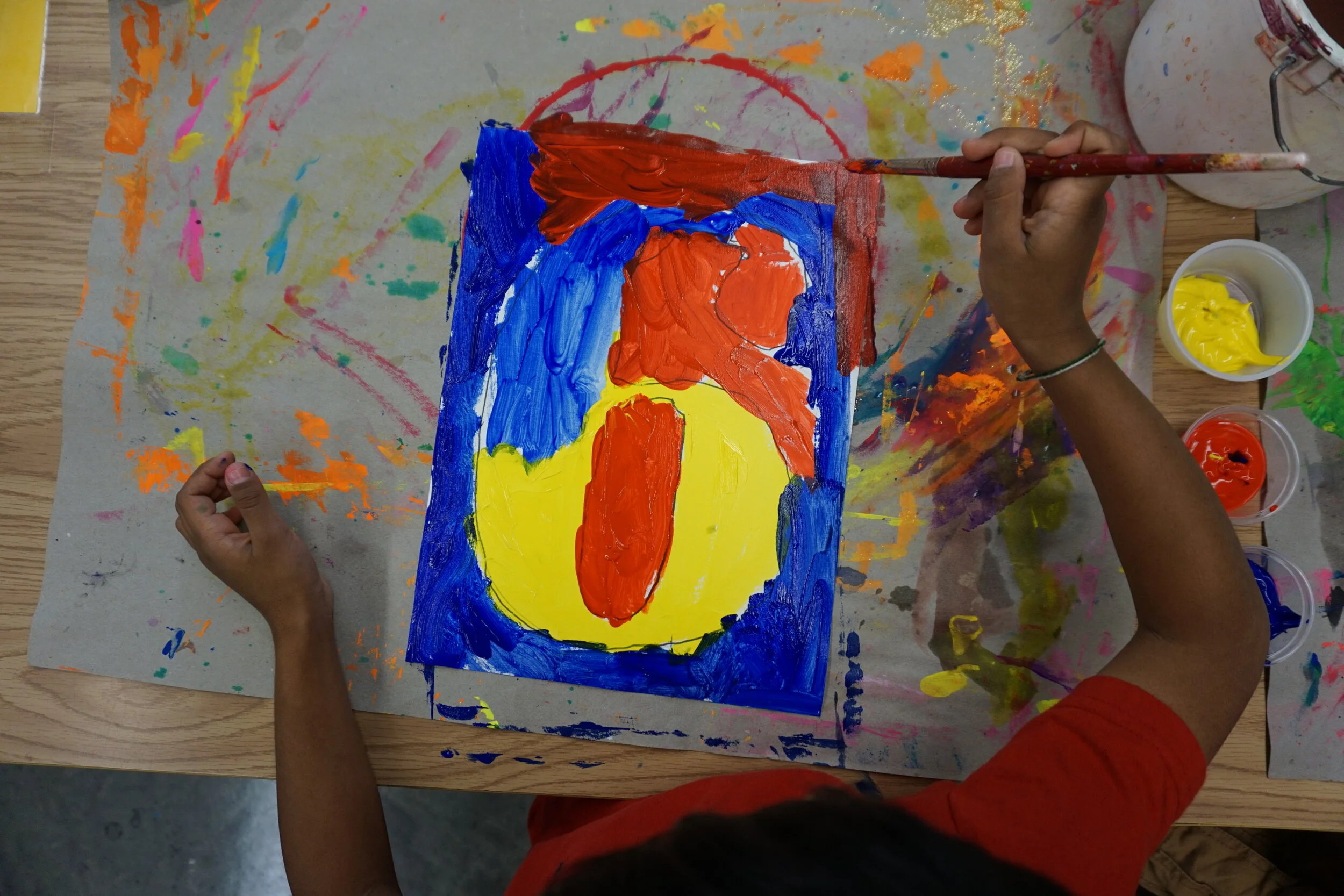

I'm always blown away by just how unique and beautiful each painting turns out. The unexpected movement and rhythm of their brushstrokes is delightful. These are Kinders! Five and six year olds accomplished great things here. We learned a little about an iconic artist and we've gotten a little messy. Woo hoo! Happy making!